Overview
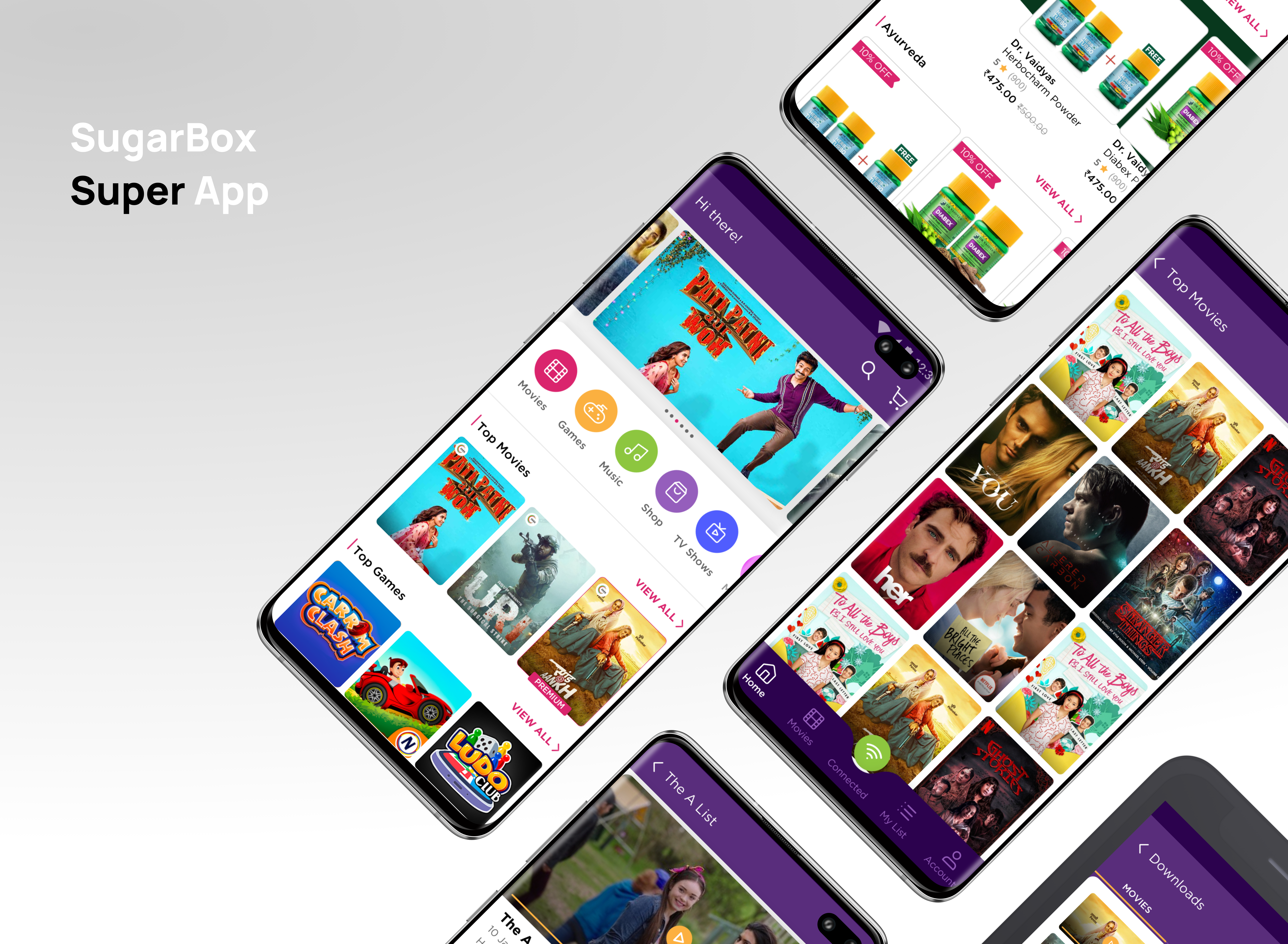
SugarBox Networks built a hyperlocal content delivery platform that allowed its users to stream, shop, and browse without relying on mobile data. The platform cached content on local servers, making access faster and possible even in low-connectivity areas. This case study explores my work on their consumer application. Please Note: This is a very brief overview. Please reach out to discuss this project in more detail.
As a UI/UX designer working in a fast-paced environment, I had the end-to-end design for multiple initiatives: designing the onboarding experience, the e-commerce user journey, the connected and disconnected user journeys, as well as developing new engagement features such as autoplay trailers and social sign-ons.
Company
Role
Timeline
Problem Statement
SugarBox operated in an unconventional design space, providing internet-like experiences in regions with inconsistent connectivity. This introduced complex UX challenges around user awareness, expectation management, and trust.
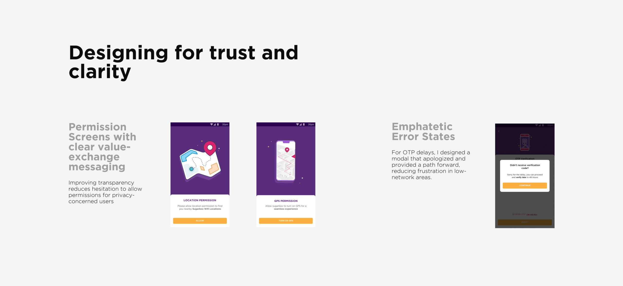
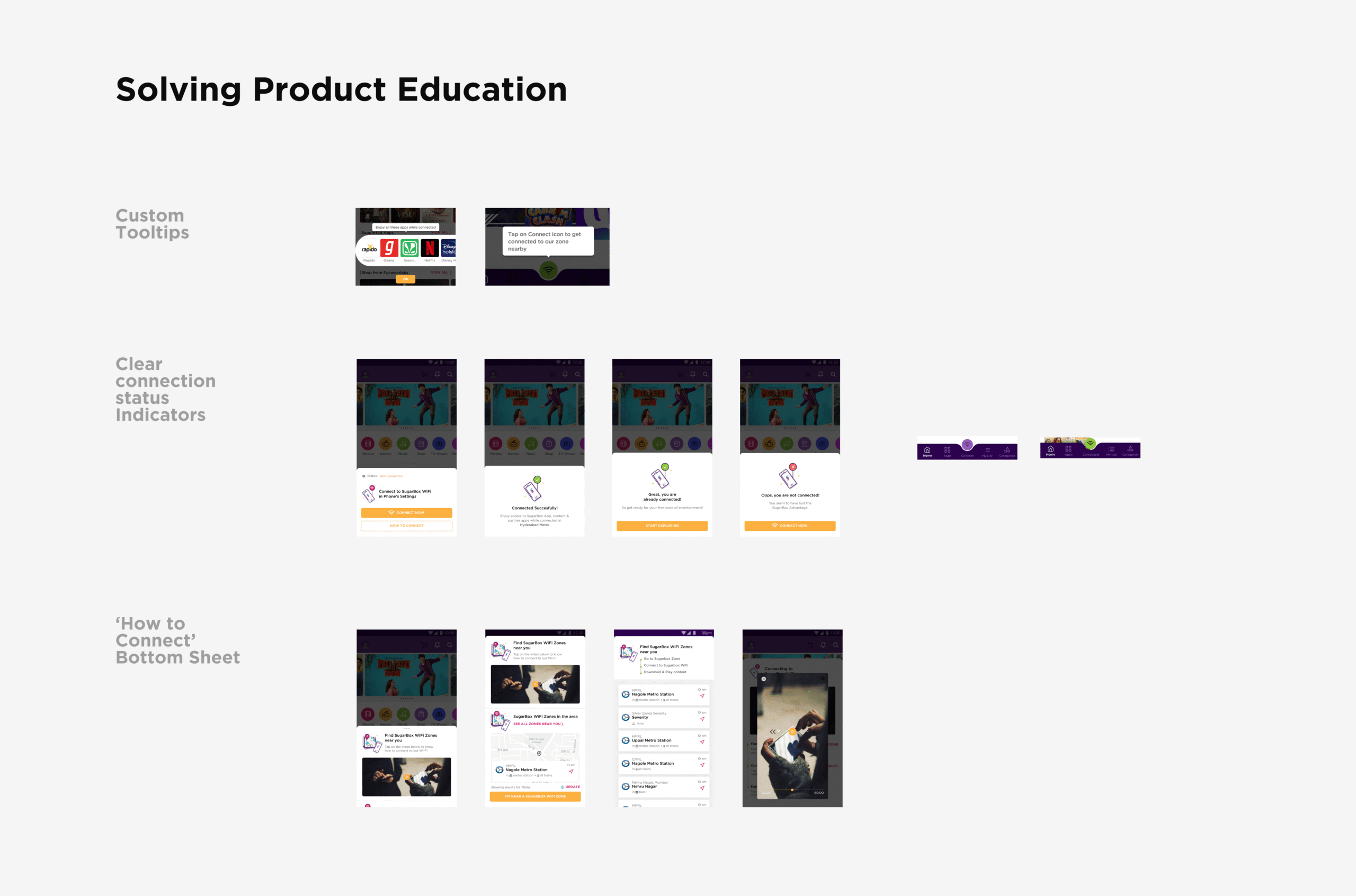
Early user testing and stakeholder discussions revealed a recurring pattern: users did not fully understand what SugarBox was and how to connect to SugarBox zones. This gap resulted in low activation and engagement rates despite strong technical innovation.
Research and Insights
To understand the challenges and pain points for our users, I participated in user interviews, heuristic evaluations, and competitive benchmarking.
Initial research revealed these core problems:
Design Approach
1. Onboarding that builds clarity
Redesigned the onboarding flow to indicate clear value proposition and improve user discoverability.
- Incorporated a short video explaining how to connect to SugarBox.
- Tutorial screens were added with clear to follow steps.
- Onboarding was redefined as a layered learning experience rather than a one-time introduction. Tooltips and contextual prompts were introduced progressively, surfacing at the moment of relevance. This approach reduced friction and improved user comprehension without increasing cognitive load.
Impact: Reduced onboarding friction, increased comprehension of SugarBox’s value proposition, and improved user cognition.
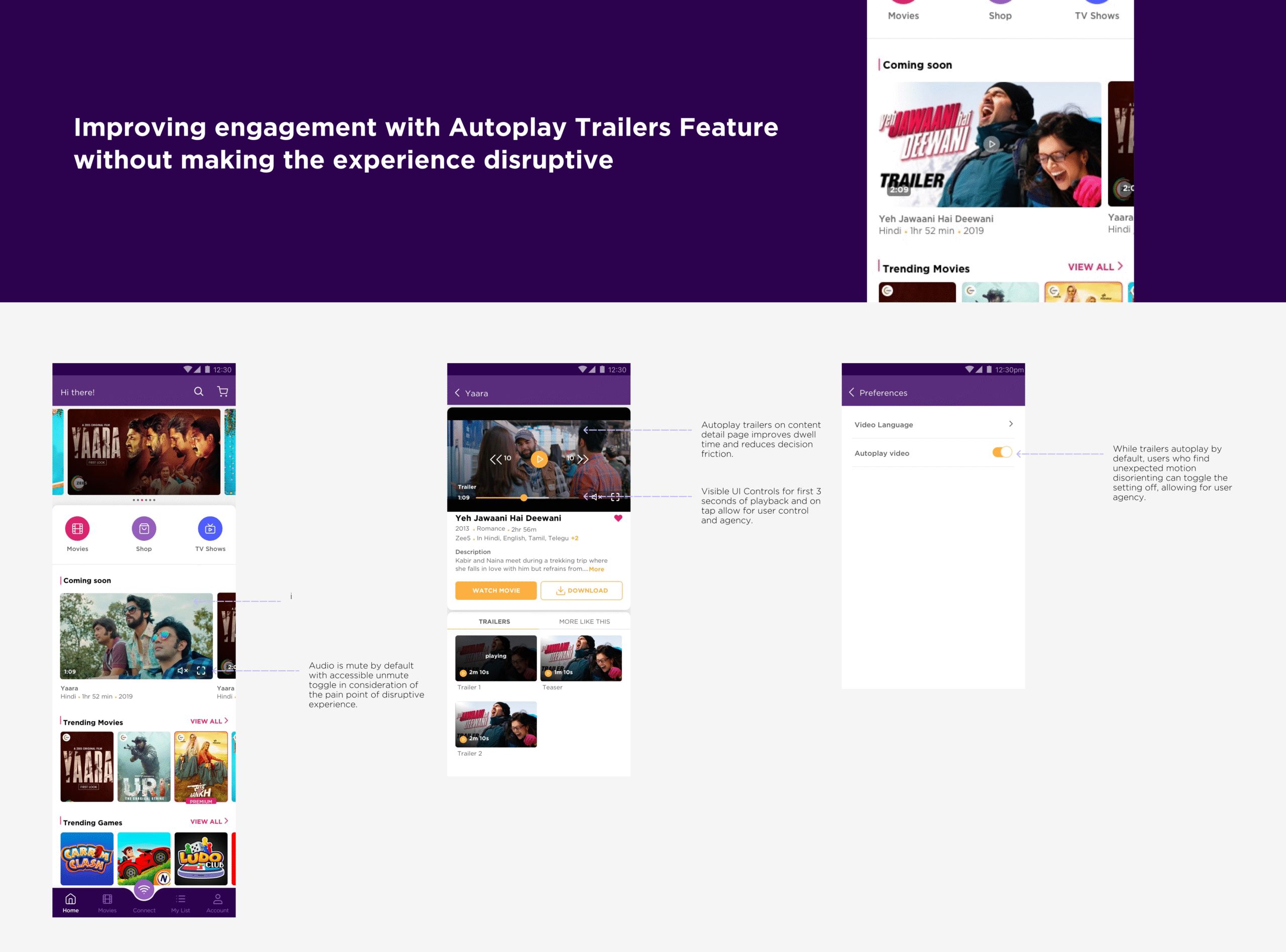
2. Designing for Engagement
Since engagement was a key metric, we wanted users to discover and explore more content early on.
-
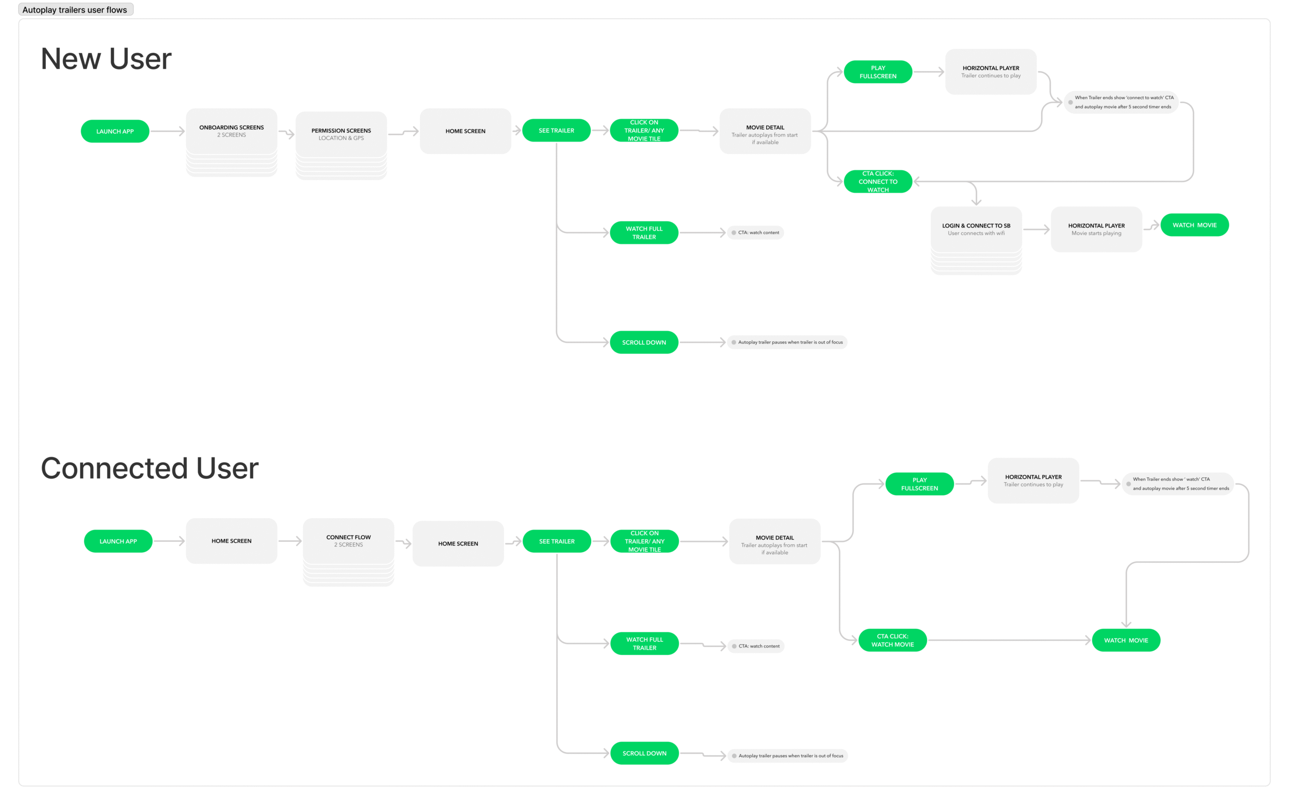
I designed the Autoplay Trailers feature to bring energy and motion into the experience.
-
Introduced autoplay on content listing and detail screens to reduce decision friction
This way users were guided toward exploration of new content rather than passive browsing.
3. Expanding to E-commerce
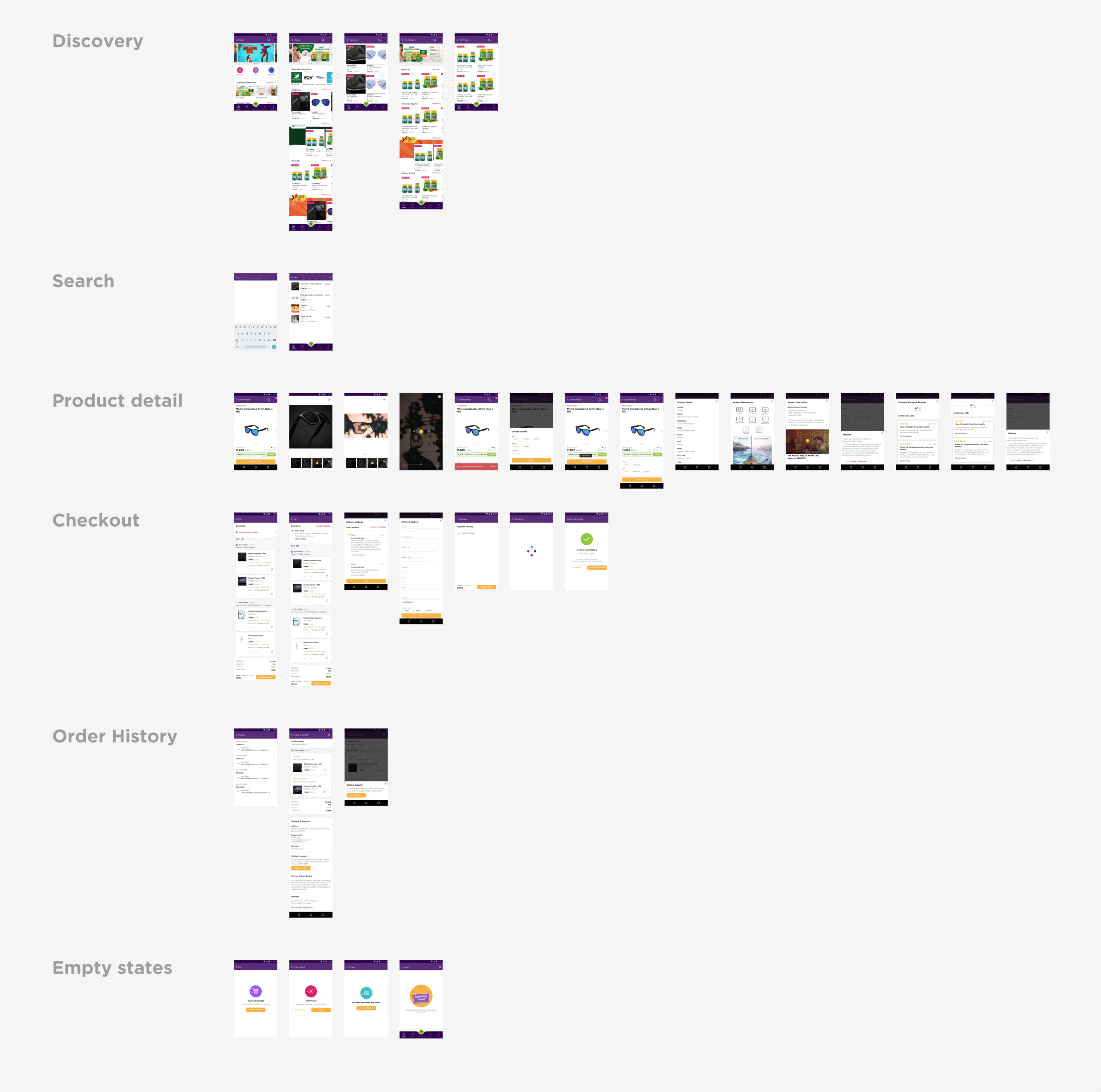
SugarBox later decided to add an e-commerce section on the app to drive growth and add a new revenue stream. I was responsible to design the entire shopping flow from 0-to-1. The challenge was to create an intuitive and frictionless flow while ensuring it felt visually consistent with the entertainment side of the product. I designed the end-to-end experience from discovery to checkout. The design was informed by competitive analysis of major e-commerce players (Amazon, Myntra, Nykaa) and benchmark studies to ensure familiarity and usability.
Process & Collaboration
I worked end-to-end, from mapping user journeys to delivering high-fidelity designs. I collaborated closely with cross-functional teams consisting of engineers, product stakeholders, marketing as well as QA teams to ensure alignment and smooth handoffs and consistency between the designs and the front-end.
Deliverables included:
- Research synthesis
- User flows and tasks flows
- Information architecture diagrams
- High-fidelity UI designs
- Clickable prototypes in Figma and Marvel
Learning & Takeaway
Working at SugarBox strengthened my capability to design for technical complexity, behavioral nuance, and environmental constraints simultaneously.
I learned to -
Translate ambiguous requirements into structured user journeys.
Make intent-based design decisions, grounded in insights rather than assumptions.
Advocate for systemic coherence, ensuring micro-interactions aligned with macro user goals.
Collaborate cross-functionally under startup velocity while maintaining design integrity.