Overview
Company
Role
Timeline
Discovery and Research
Stakeholder Interviews and User Personas
I conducted stakeholder interviews with Nexfinity and two prospective expo organizers to define user personas and gain insights on user and business needs. The solution needed to serve two primary users:
Expo Organizers (Clients): Who need business tools, sponsorship revenue, and attendee insights.
Attendees (End Users): Primarily women aged 25-50, seeking discovery and community at local expos.
Competitive and Contextual Analysis
I analyzed different categories of platforms for presentation of information and visual inspiration:
Local Exhibition websites, often information-dense but I gathered valuable insights on must-have information fields
Large Event Platforms, such as District and BookMyShow
Online Marketplaces, for presentation of different seller details and offerings
Key Insights
Connectivity at venues was often poor; the solutions needed offline resilience.
A mobile-first solution was desirable for attendees, given the requirement for outdoor access.
Sponsorship revenue was limited to physical banners; digital real estate was untapped.
Attendees wanted to see vendors, offers, and activities before arriving.
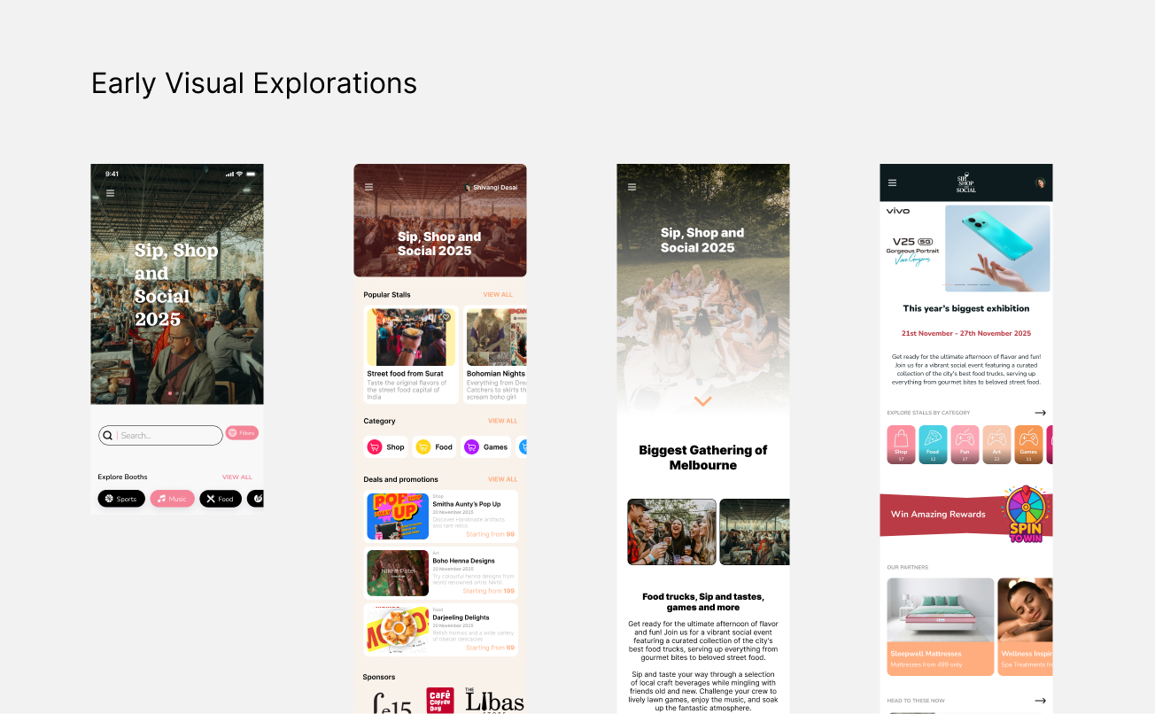
Iterations and Validation
Developer Collaboration: Ensured feasibility of features and proritised component reusability from discussions with the engineering team.
Strategic Design Decisions
Architecture for Scalability & White-Labeling
Limited Color Palette for white labeling
Created a modular component library in Figma with a limited, vibrant palette (inspired by Etsy’s warmth but more restrained). Using a limited color set allowed easy rebranding for different expo clients—a paid add-on for the SaaS.
Typography Choice
Selected Inter for its readability, free license, and exceptional performance at low weights. This reduced page load times significantly, which is a critical factor for outdoor access
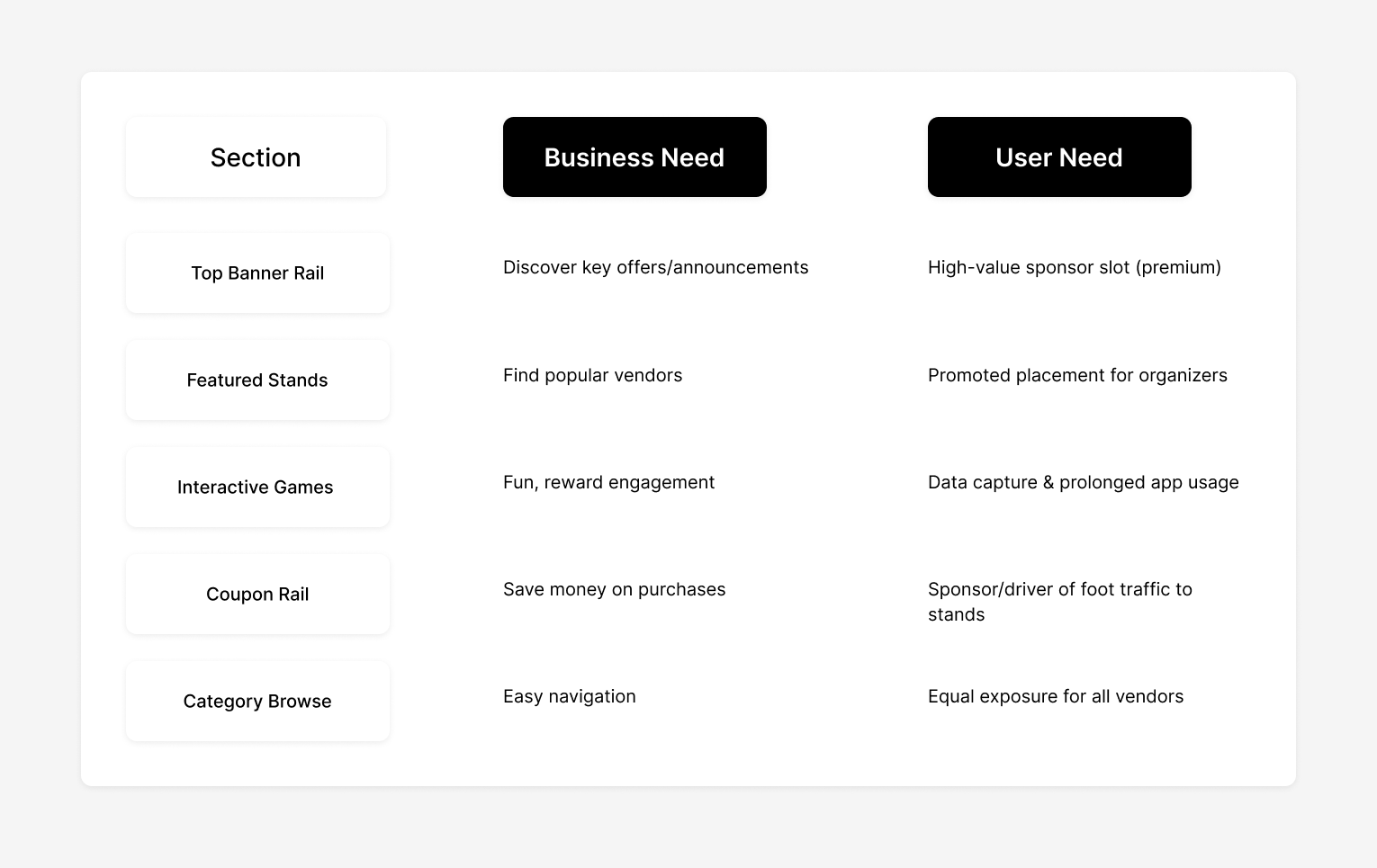
Content Priority framework
Designed information hierarchy to accommodate dynamic “ad slots” without disrupting core UX.
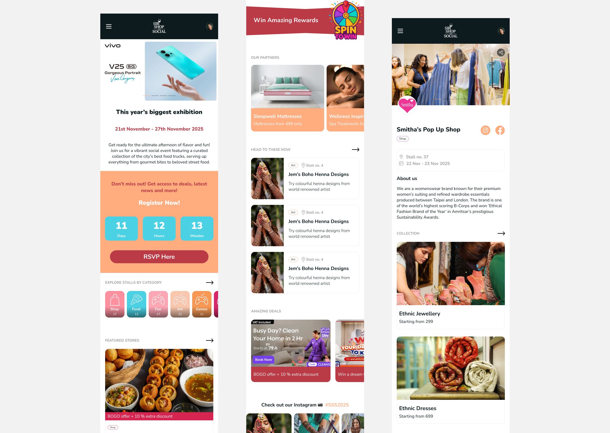
Pre Event Engagement Loop
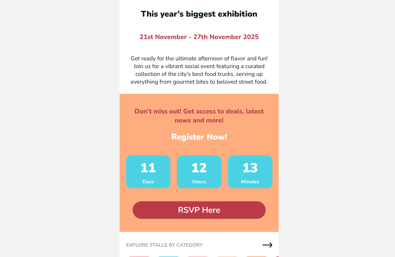
Countdown & Registration
Designed a prominent pre-event countdown with registration CTA. This solved the organizer’s need for predictable attendance metrics while building anticipation.
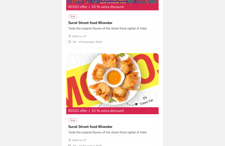
Vendor Preview
Enabled browsing of stands and “favoriting” before the event, thus giving attendees a plan and vendors early visibility.
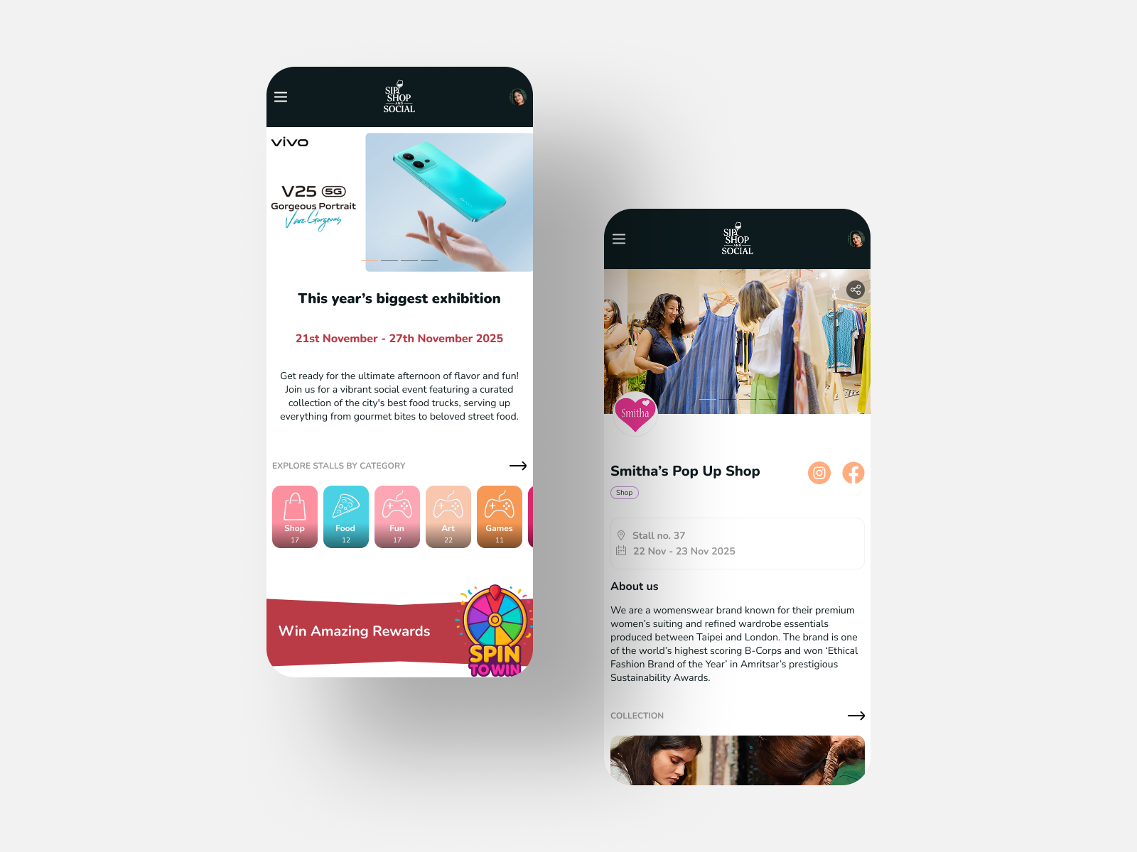
Home Screen as Engagement Hub
The home screen was strategically structured to serve both user and business goals
The “No-Cart” Decision
Per client requirement, purchasing remained at physical stands to preserve human interaction. Instead, I focused on products and offers discovery on the stand page.
Stand Page Design
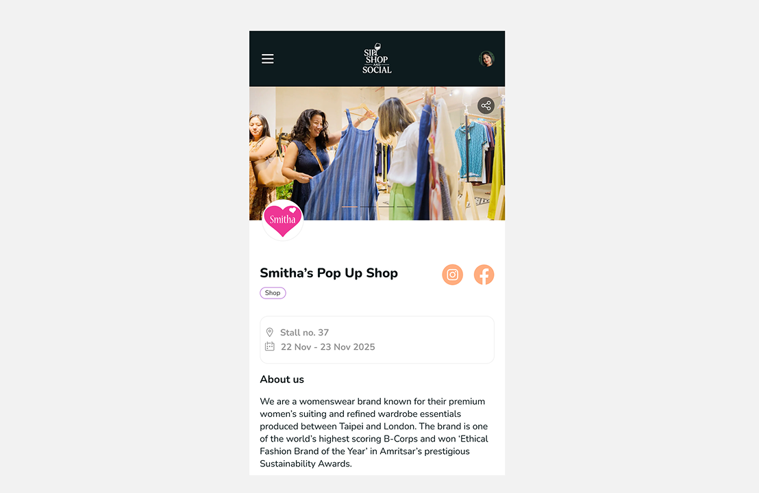
Hero Section
Clear branding space for the vendor, with a focus on personal connection (owner photo, story snippet) and social sharing
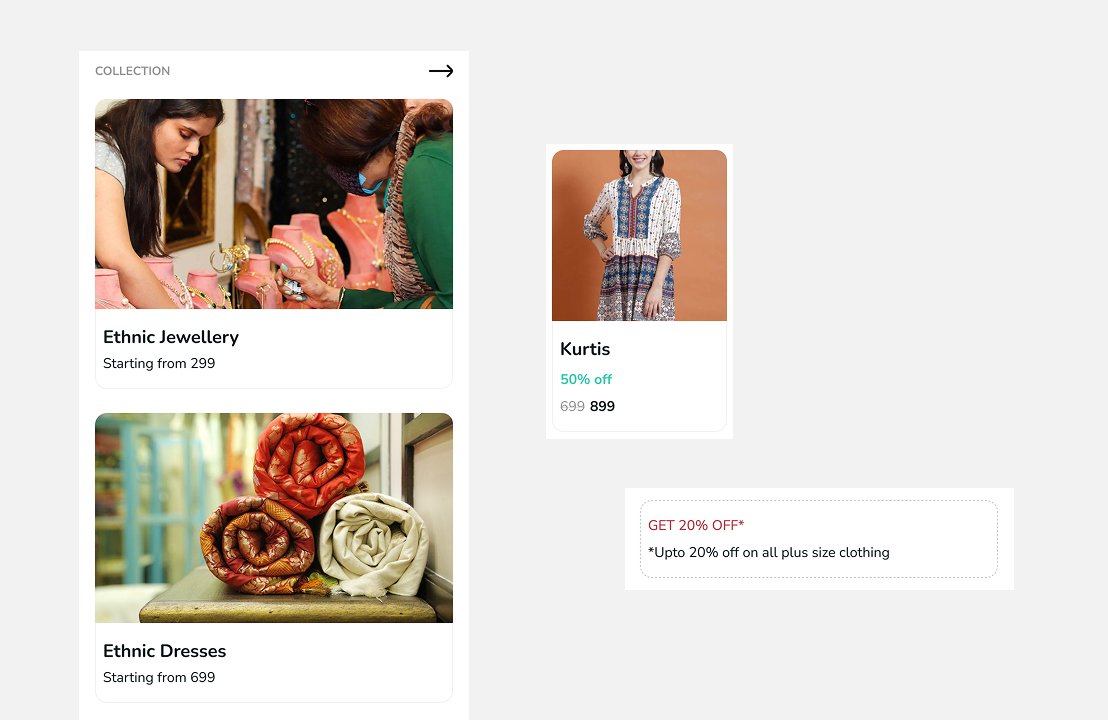
Product and offers discovery
Emphasized grids with collections, discounts, unique offers
Outcome and Reflection
The design was approved for development with: All core features included in Phase 1 development, multiple advertising integrations as primary revenue model and a scalable theming system for clients.
Measurable Success Metrics (to be tracked post-launch):
- Attendee registration conversion rate
- Average time spent in app during event
- Advertising click-through rates
- Game participation percentage
- Stand "save" interactions